
Stepping out of a color comfort zone, by Lucie Vacková
For those living in a long-term relationship with interiors of muted shades, it’s nearly impossible to fall in love with colorful objects overnight. But there are exceptions, like Lucie Vacková, who recently introduced an amazing colorful change into her space.
Lucie is an English teacher by profession, who decided to pursue a career in interior design as a freelance
photographer and interior stylist. She also runs an inspiring Instagram account @the.aesthetic.eye.
Embark upon a journey of stepping out of a color comfort zone and check out how Lucie’s lovely, monochrome
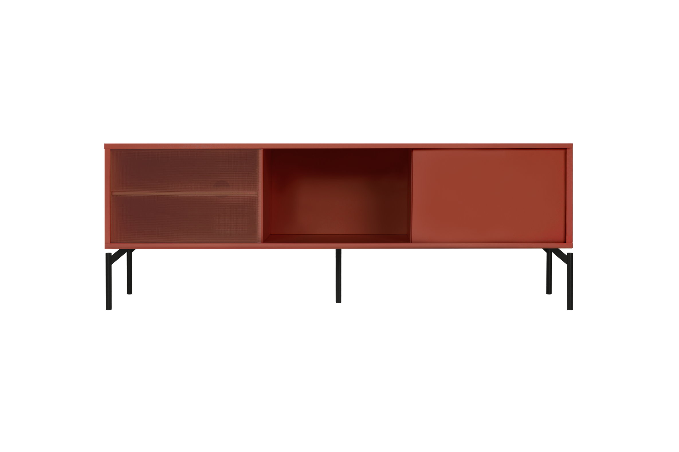
interior gained a more colorful expression. We couldn’t be happier to see our Met Media Furniture in Terracotta Blush being a
foundation of that makeover!
Read Lucie's story and experience firsthand her new colorful adventure.


I have always been in a sort of a love-hate relationship with colors in interior design. Whenever I tried to incorporate one in my home, I got almost sick of it very, very soon. More or less, I have always stuck with muted shades of beige, grey, black and white. Do I think a monochrome home is timeless? Yes, absolutely. Chances are high that I will still like such a color scheme in ten, even twenty years.
Our comfort zone is where we feel most at home, but stepping out of it can become a new and valuable experience.
Lucie Vackova - interior designer & photographer
I soon realised that subdued color palette lies within my comfort zone. Ironically, our comfort zone is where we feel most at home: staying within its boundaries brings a steady performance. But stepping out of it can become a new and valuable experience. This is also very true when it comes to interior design and styling. So the question I asked myself some time ago was: am I ready to invite a large splash of color to my interior? Yes! And the answer is noo.ma.

Being a color rookie, I felt pretty daring to have chosen the Met Media Furniture in an eye-catching Terracotta Blush color. Both the shape and the very color of the piece give it a slightly mid-century modern vibe, which is perfect for a home influenced by Scandinavian design. Mid-century and Scandinavian designs work well together as they both owe a lot to the Bauhaus Movement.


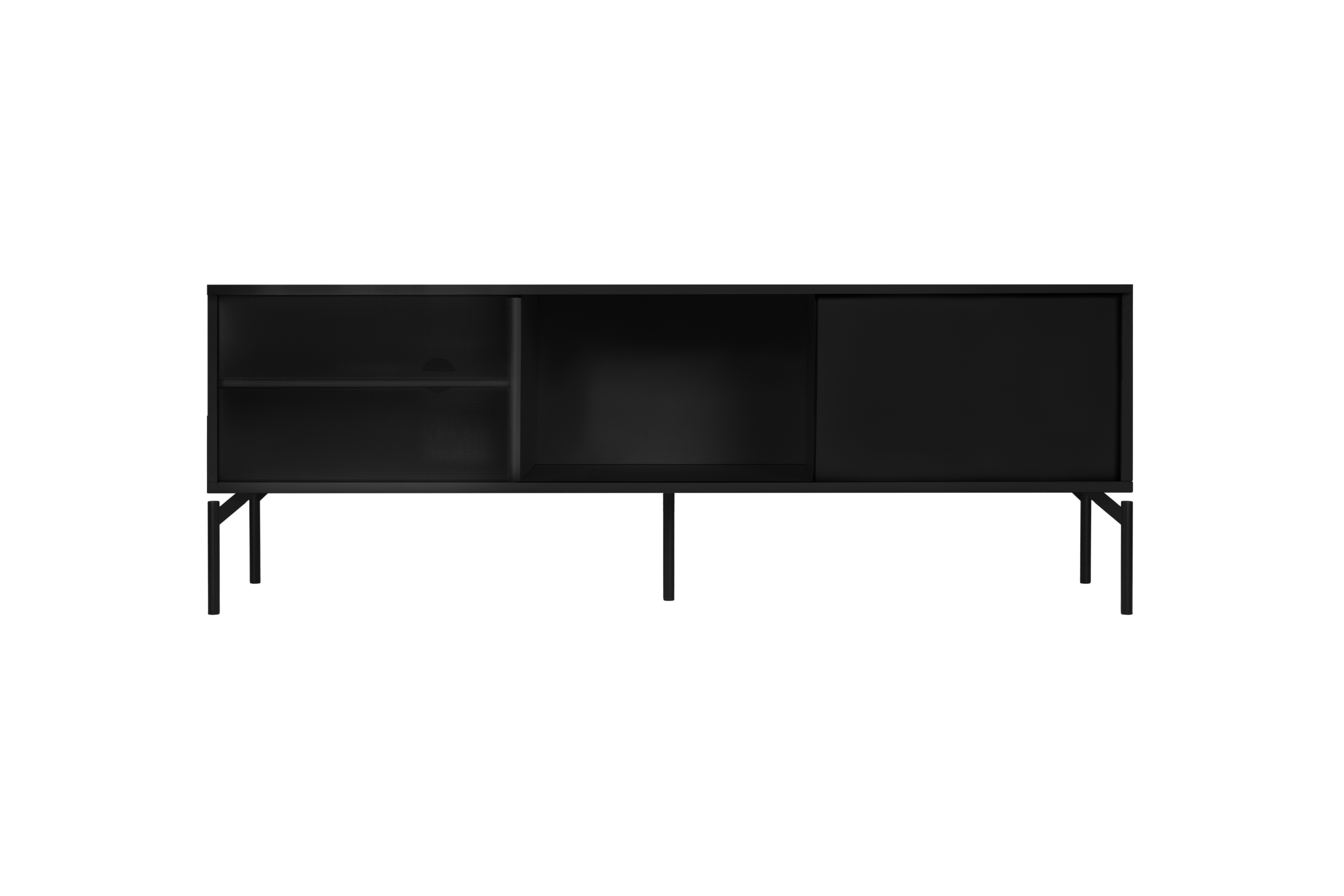
Met Media Furniture is also available in Almond Grey and Vulcano Black. Although I really believe those two options are undoubtedly beautiful, the uncluttered and sleek lines of the unit allow for a more creative use of color. Terracotta Blush shade on a minimalist piece of furniture seems like a perfect choice for someone like me, who is a little wary of letting bolder colors into their home.

Whenever I craved a little bit of spice for my home, I basically resorted to adding a few coloured textiles such as sofa cushions. It almost always felt good, but never excellent. It is about time to break out of my shell and go for a more courageous expression! Being in an on-again and off-again relationship with colours for almost fifteen years, it seems I have finally found the one to settle down with for life.


