At home of Mia Mortensen — a homage to bold designs
Always inspired by shapes and spaces, Mia Mortensen started her photography journey as a teenager, experimenting with light and shade in the darkroom. Now, as an acclaimed interior photographer and an enthusiast of bold designs, she lives in a Danish 1950’s house – formerly functioning as a midwife and doctor clinic – with her fiancé Martin, their little son Aston and two cats.
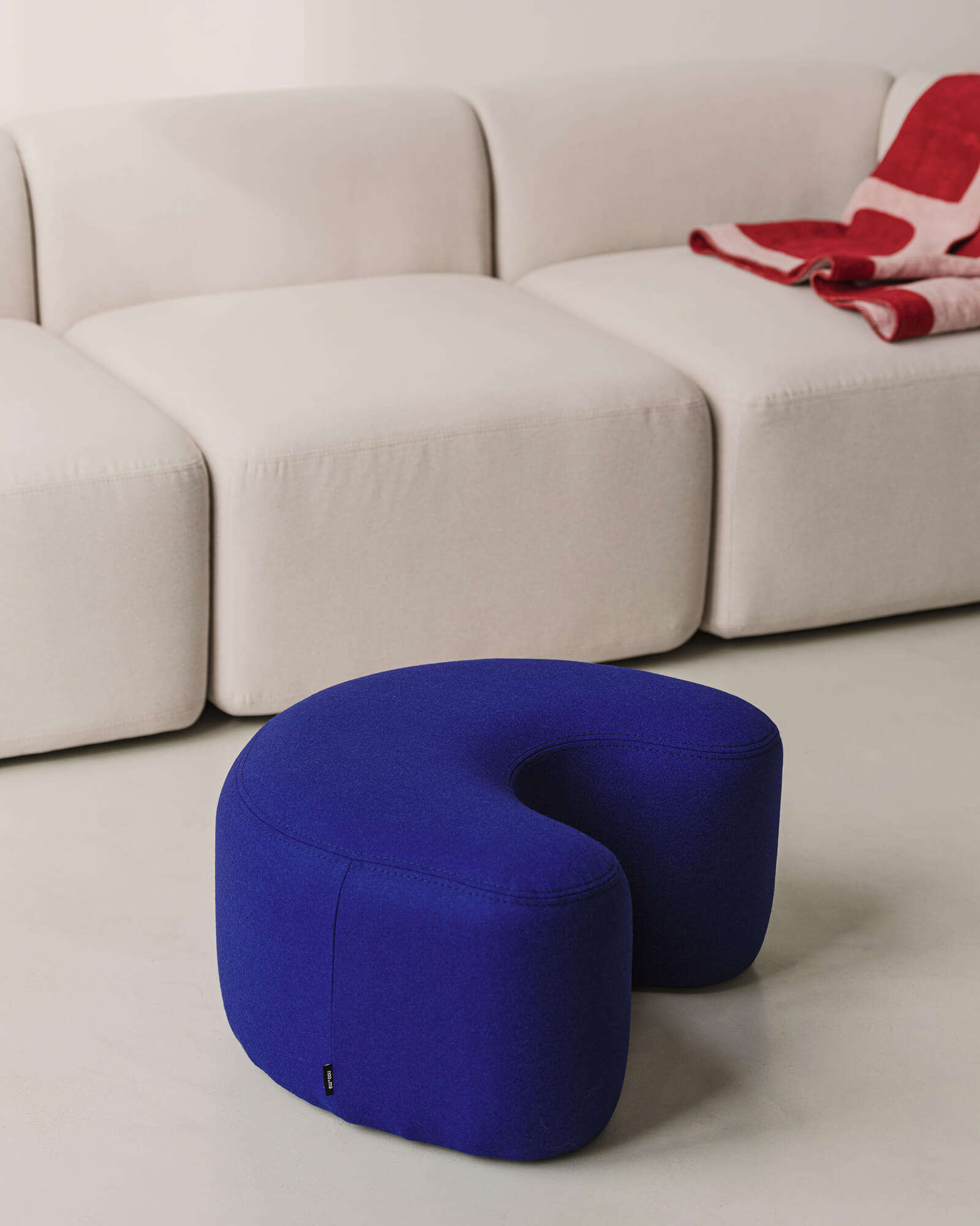
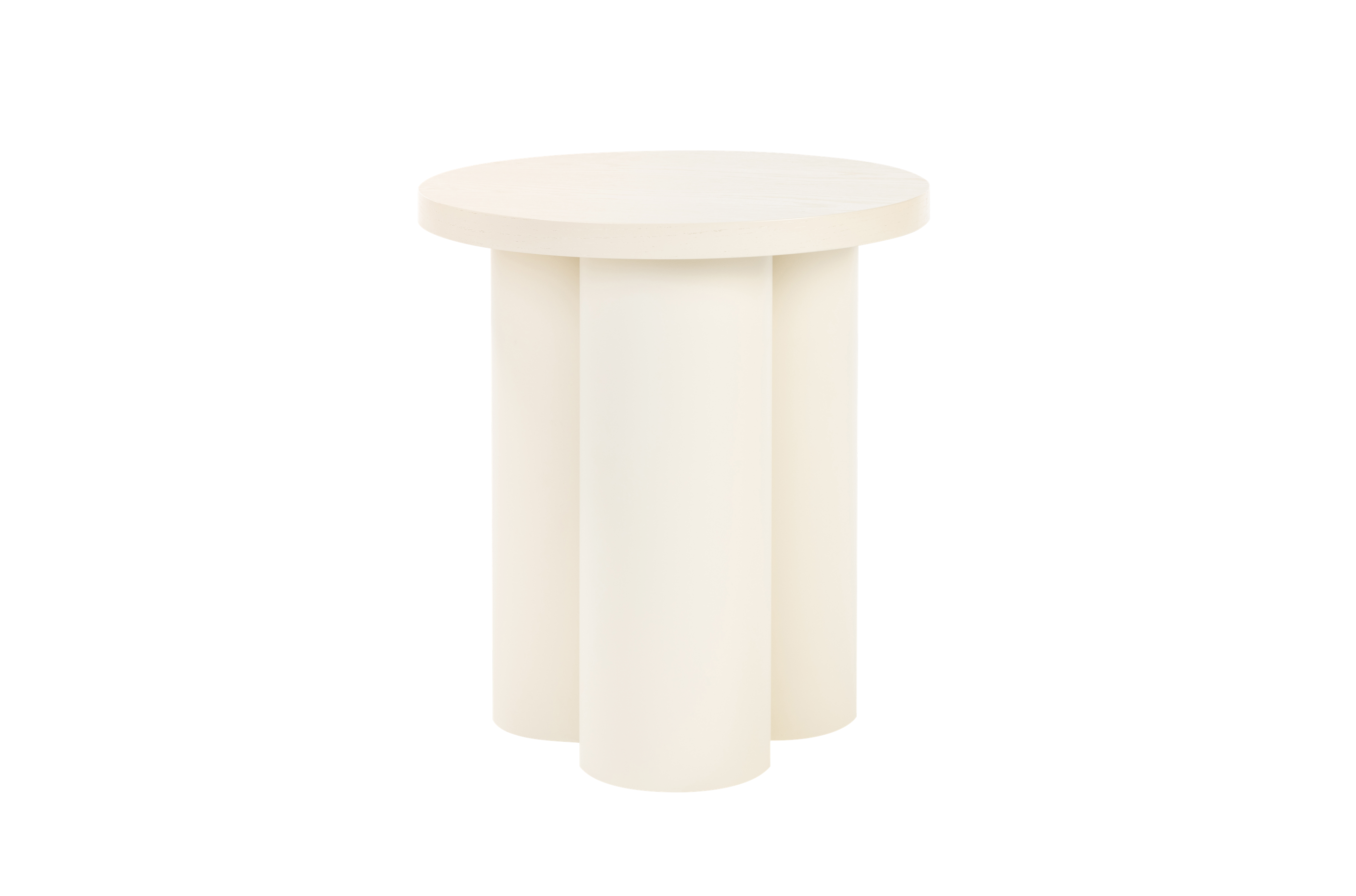
Visit the extraordinary house of Mia, filled with unexpected color combinations and exciting materials of every kind, embodied in exquisite furnishings, including noo.ma's Kuvu, Ü and Oly. Get to know her soft spot for 70’s design, her approach to visual storytelling and find out what she believes a good design should consist of.


To start with, tell us about your favorite furniture piece that you own.
One of my favourite pieces is my Verner Panton couch. It is an original from the 70’s and has only been in one home before mine. It perfectly mixes function, shape, and color.
It’s not an exaggeration to say that you’re a mastermind when it comes to mixing colors, shapes, and materials. Every corner of your home hides a surprise, be it a splash of contrasting hue, a tactile fabric, or an intriguing decorative object. We’d love to find out what’s more dominant in your decorating journey: cold calculation or gut feeling?
I always decorate with my feelings: How does the room feel when you enter it? How do the colors affect your mood and energy? I like to mix “grounded” and soft shades (wall colors) with color contrasts (furniture) to create a space with “tensions” and make it pop, so the eyes and brain have something to explore. It’s actually something I learned in the photography school: create that eye-catcher to make it unique.


It’s exciting how all those elements fit together like pieces of a complex jigsaw. We wonder what’s noo.ma's products’ place within it.
noo.ma's products are playful, with colors and round shapes, and my heart beats for that 70’s feel. They mix functionality with aesthetics which is my code for making a perfect interior.


As a professional photographer, you know the key role of light, composition, and detail — it definitely shows on your fantastic Instagram. Would you recommend applying those „photographic” rules to a person who wants to bring a change to their interior?
Definitely! Think of making the lines straight so the eyes and brain have to focus on the things you want to show (interior). Watch how the light shifts during the day, and don’t be afraid of trying new things.
Describe in three words what makes a good design?
Intuition, lasting, aesthetics.


